


From Creator to Curator
Updated: Jul 25
We often assume we need to know exactly who we are before we can build a personal brand. In reality, the opposite is usually true. It is only after we create, experiment, and gain experience that the patterns begin to emerge.
For months, I kept producing projects that felt increasingly connected (research-heavy articles, editorial layouts, cultural analysis, brand strategy) but my visual identity was still introducing me as the person I had been two years earlier.

It wasn't until I stepped back and looked at my work as a whole that I realized the disconnect wasn't in the portfolio, it was in the branding. The projects had already begun telling a different story than the identity I had built around them.
This rebrand wasn't really about changing a visual identity. It was about recognizing the one I'd already been building. Because the best rebrands aren't about becoming someone new, they're about uncovering the person your work has been introducing all along.
Social by Design v.1
Social by Design, my monthly LinkedIn newsletter exploring branding, culture, and human behavior, was born during one of the toughest hiring markets in recent memory.
Like many recent graduates, I spent months caught in a cycle that felt increasingly familiar: submit another application, rewrite another cover letter, refresh LinkedIn, repeat.
Eventually I realized I could spend all of my energy waiting for someone else to give me experience, or I could start creating it myself. Social by Design became that opportunity.

It gave me a place to practice strategy, writing, visual design, and branding while continuing to refine the journalism skills I'd developed in college. More importantly, it gave me a reason to keep creating when job applications weren't producing much momentum.
The Search for Identity
The original brand reflected exactly where I was professionally—the beginning.
Fresh out of college, I naturally gravitated toward the world I knew best; books, magazines, essays, and long-form storytelling.

That philosophy shaped everything I created: a career guide might open with a quote from Joseph Heller, another article about Instagram might use The Catcher in the Rye to explain authenticity online.
The visuals reflected that mindset: terracotta accents, cream paper backgrounds, distressed textures, torn edges, vintage stamps, typewriter-inspired typography, and the feather logo all borrowed from the romantic image I had of journalism and traditional publishing.
The inspiration was unmistakably rooted in journalism but in the romanticized version I imagined as a recent graduate—not yet the one I had experienced.
As much as I wanted to I couldn't simply decide what Social by Design should be, the identity could only reveal itself after I started publishing.
Every article, every freelance project, every internship, and every job quietly narrowed the focus:
Working in journalism strengthened my love of research and long-form storytelling.
Social media management taught me that understanding people mattered more than understanding platforms.
Branding projects made me realize I was less interested in making things look good than understanding why certain ideas resonate in the first place.
Fashion marketing showed me that even clothing tells stories about identity, aspiration, and belonging.
Without realizing it, I kept producing work that looked increasingly connected.

The publication wasn't changing because I had a new strategy, it was changing because I was. Every new project became another clue about the kind of work I naturally gravitated toward.
Designing a Brand That Matched
Once I understood that my work had shifted, the visual direction became much clearer.
Ironically, AI became one of the most useful tools in that process, not because it designed the brand for me, but because it helped organize ideas I had already been accumulating for months. It gave structure to creative instincts that previously felt disconnected.

The process felt less like designing a new identity and more like sculpting one, removing everything that wasn't essential until what remained finally felt true.
Rather than pulling inspiration from traditional marketing brands, I started looking at editorial magazines, museum identities, exhibition catalogs, creative agencies, fashion campaign books, and contemporary art direction. What connected all of those references wasn't a specific color palette or logo style—it was confidence.
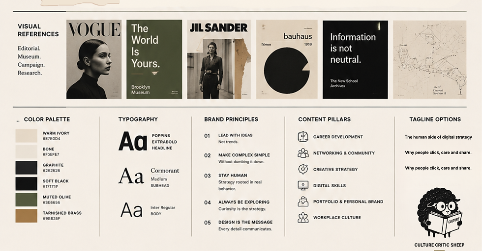
In my new design the typography became larger and more restrained, inspired by museum exhibition catalogs where a single headline is often allowed to occupy an entire wall. Photography took on a more prominent role and decorative elements were reduced. Every design decision asked the same question:
Does this help communicate the work, or is it simply decoration?

The color palette changed for the same reason. The warm terracotta tones gave way to warm ivory, graphite, and soft black (a quieter palette that felt less like Instagram branding and more like an editorial publication). It allowed the writing, graphic design, and research to become the focal point rather than competing with them.
The Perspective Behind the Brand
As the visual identity came together, I realized something was missing.
The typography felt mature, the editorial layouts reflected the depth of my research, the museum-inspired design communicated the kind of work I wanted to be known for: investigative, research-driven, and rooted in cultural analysis.
But it was almost too polished. It captured the professional side of my work, but not the personality behind it.
Anyone can borrow an editorial aesthetic. What separates a brand isn't the typography or the color palette, it's the perspective behind the work.
That's where the black sheep came in. At first glance, it's just a tiny mascot wearing glasses. In reality, it's the part of the brand that feels the most like me.

The black sheep isn't there to be contrarian for the sake of it. It represents curiosity, pattern recognition, and the willingness to question consensus before accepting it. It also reminds people that behind the research, typography, and strategy is a person with a dry sense of humor. Without that, it couldn't possibly be me.
In many ways, that tiny black sheep became the final piece of the rebrand, not because it changed the direction of the brand, but because it reminded me that professionalism and personality don't have to compete with each other. Sometimes the smallest detail is the one that makes the work unmistakably yours.
What Rebranding Actually Means
Looking back, I don't think my brand was ever something I had to invent. It was something I had to recognize.
Not by choosing a logo or writing a positioning statement, but by publishing articles, experimenting with ideas, accepting jobs that challenged me, and paying attention to the work I couldn't stop coming back to.
Every experience narrowed the focus a little more. Journalism taught me to research. Social media taught me to study people instead of platforms. Branding taught me that design isn't decoration, it's communication and marketing taught me that every campaign is really a story about human behavior.
Eventually those interests stopped feeling separate. They became a pattern and that's what a rebrand is really all about. Not a new identity, but a clearer expression of the one that had been taking shape all along.


Comments